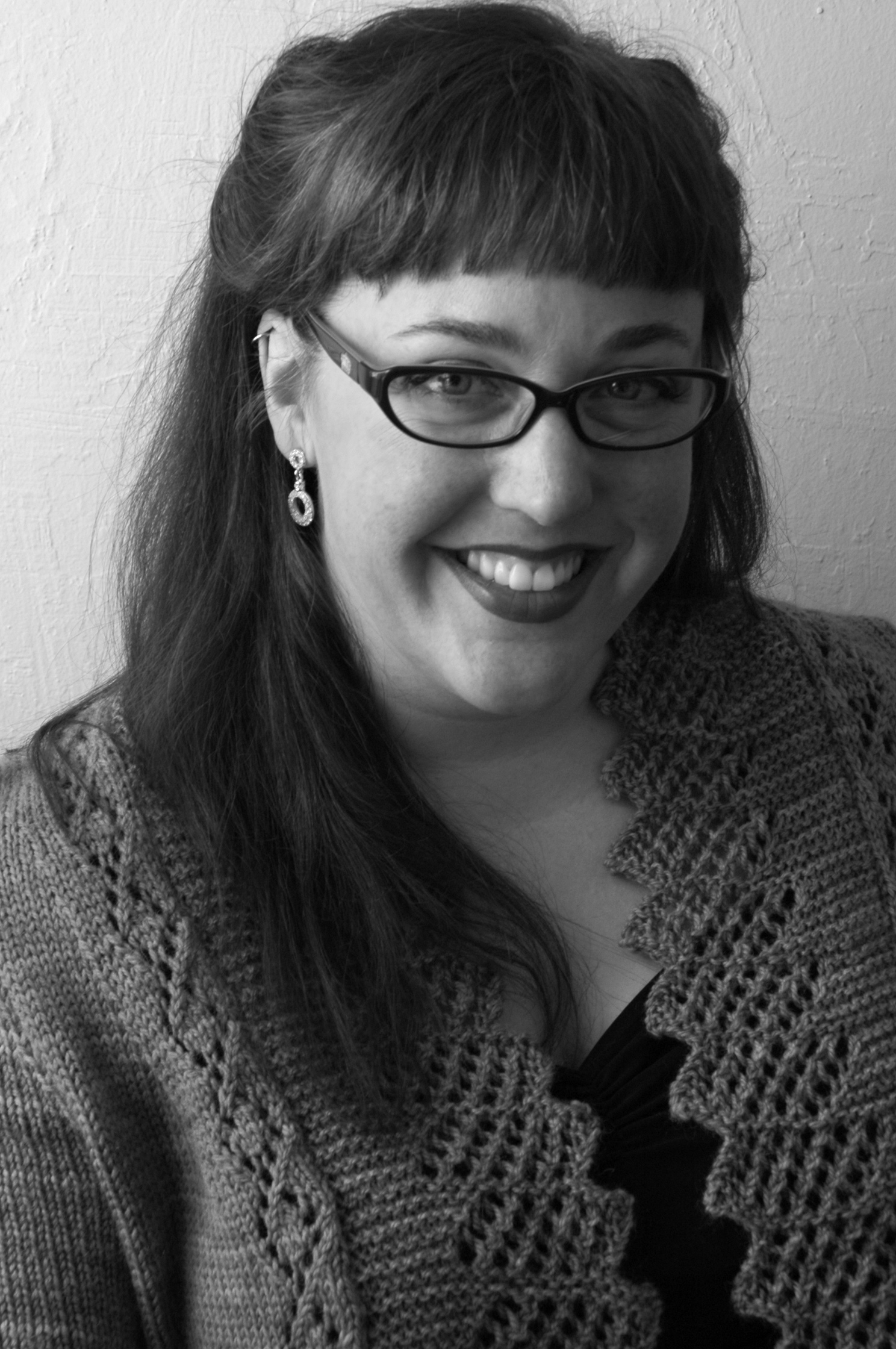
Good morning! Hey, guess what? I got my author photos done! Whoohoo! It wasn't as painful as I thought, mostly because I had them shot by the phenomenal photographer Khalil Robinson.
But I can't decide. Let's talk it out, shall we, and there's a poll or two at the bottom for your convenience (if you're reading me in a blog-reader, click on in to vote! Please?).
COLOR POLL
Number 1:
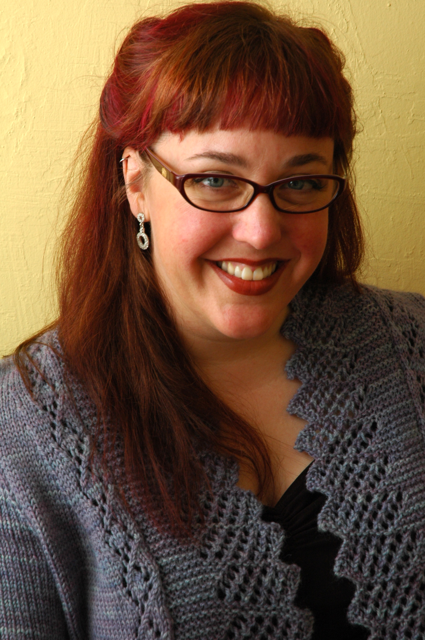
DELETED: I was going to write my criticism of each photo. I even did a couple and it was fun, because it's always kind of fun to be self-deprecating. Instead, I'll just shut up and let you vote. I will ask, however, to consider if my shoulders look too high in this one. Moving on.
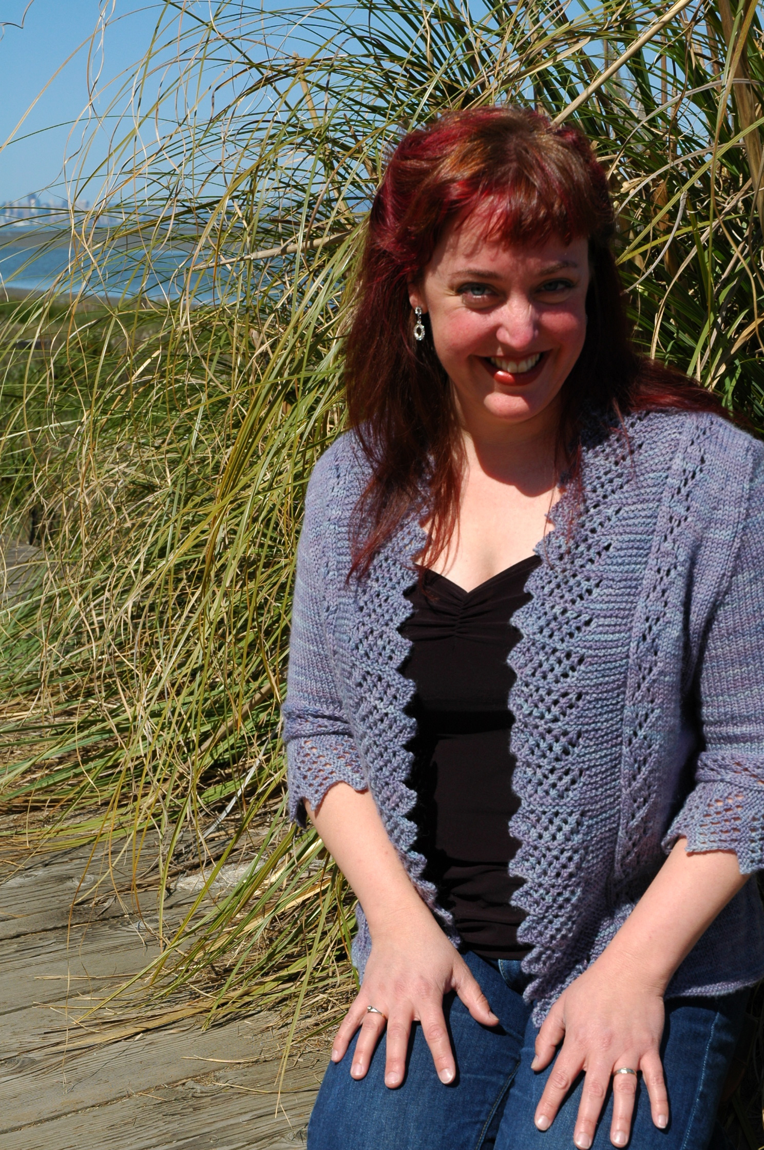
Number 2:
Number 3:
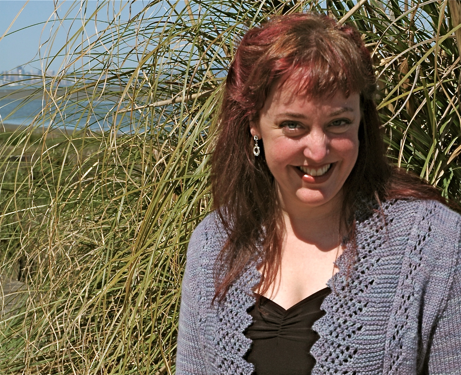
(Same as above, but cropped and shadows lessened.)
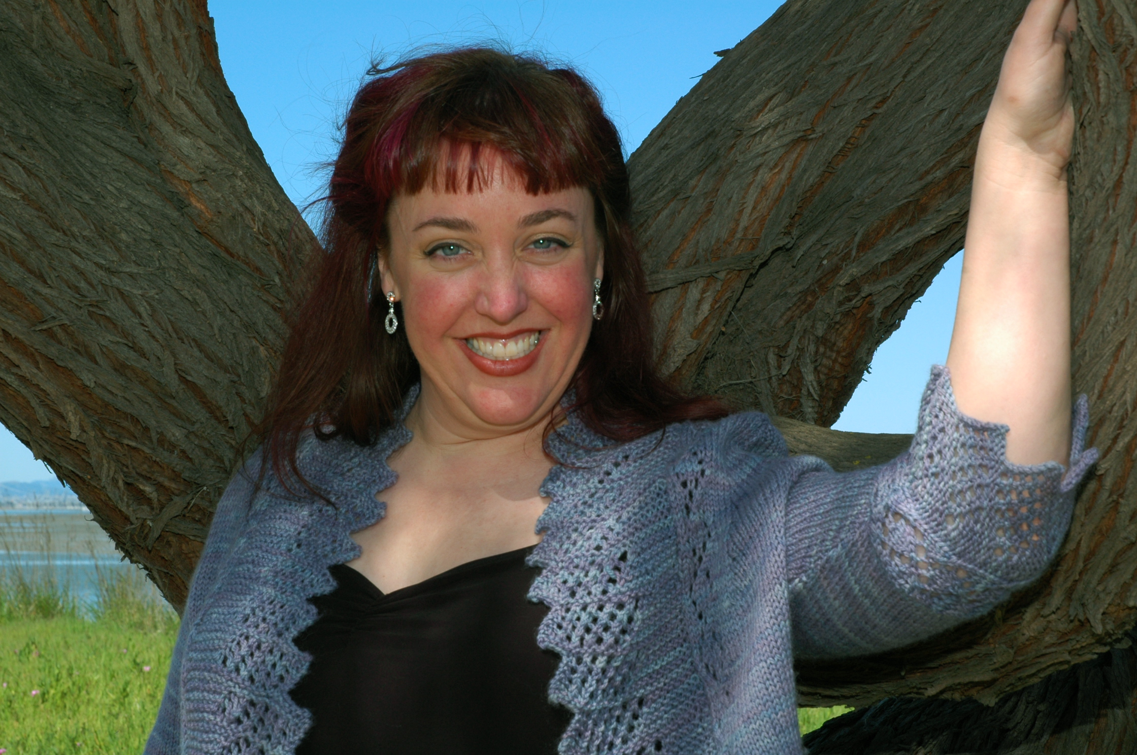
Number 4:

Number 5:
Number 6:

VOTE!
MORE FUN – BLACK AND WHITE!
Would you vote on one of these two, also? THANK YOU!
Number 1:
Number 2:
fun! you’re very photogenic so this was hard! as i voted the black and white were split 50/50 so…good luck deciding… 🙂
Gotta have the glasses, hon. Photo 1 is super cute, definitely a plus for the romance author!
For some reason I like the one with your hands.
Nice sweater!
I liked the first one best anyway, but want to point out that even if you go with one of the others as your jacket photo, make sure you have a photo with a plain background available for publicity stuff. That’s something we run into ALL the time, especially with newer authors, and sometimes it means that we can’t run a photo at all. 🙁
I’m a sucker for a poll. Oh wait, a poll sucker? Well, I suppose so, among other things.
Anyway, I like #5 best among the color shots – it’s the diffuse lighting (and winning smile, natcherly) that does it – and b/w #1.
You look sexy/fabulous in the glasses shots.
They’re all beautiful, Rachael!
Rachael, I like number 1 (as many seem to), but it looks slightly out of focus to me compared to 5 – and I don’t have that problem with the B/W version. So I guess I’m saying just ignore me 🙂
I love the sweater that you picked for the shots! You look great in all of them, but the first one just popped. I also meant to tell you that I love the last pic in your anniversary post!
Rachael–
I like number one much better as a black and white. Where did you get your pictures done?? And yay for wearing the totally cool sweater 🙂 🙂
Lisa
You’re so photogenic!
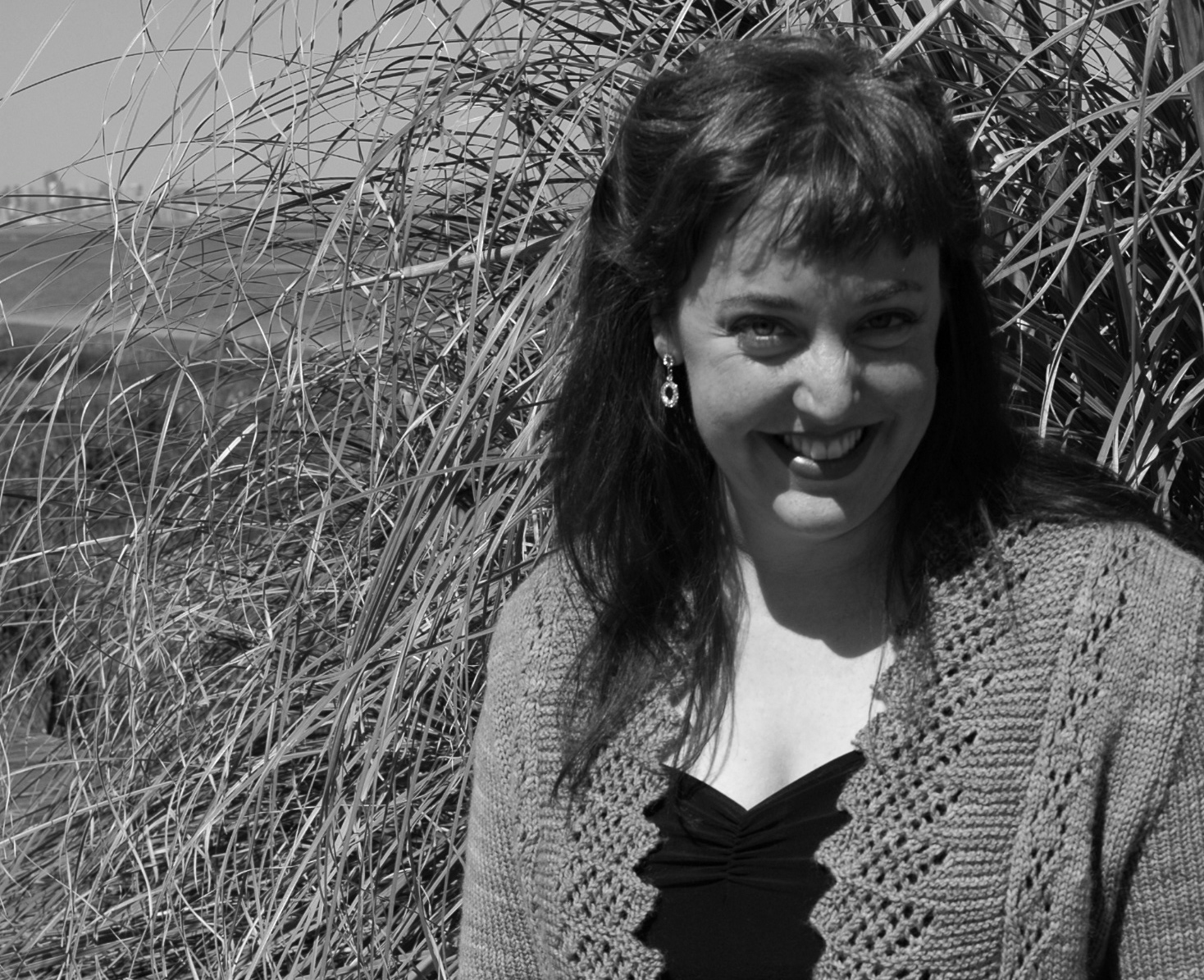
first of all, you are gorgeous in every picture! Second, I can’t believe so few people voted with me for number two (color)! I love the outside pictures. They tell more of a story.
I’m worried about the shadows on your face, even in the version where that’s been lightened. People will want to see what you LOOK like, and the shadows are distracting (says me).
They are all lovely, but for a romance book, a little cleavage is awesome! Go four!
I love all your pictures but I think the ones against the plain background bring out your face better for an author photo. Whichever you pick, you look beautiful.
Hi Rachael…ALL of these photos are beautiful….your colouring is lovely….but for a jacket cover photo #1 is best! The others have too much distracting and draw attention away from you instead of to you…
i really liked #4 but the shadows would have to be lessened…
but #1 is very “author”-ey so i suspect that will be the winner…
and omg your sweater is so gorgeous and you look fab in it!
The Good News: all the photos are awesome. How nice to get to choose the best when they all rock.
The Bad News: you are wearing my favorite sweater so it will be harder for me to abscond with it. Dang!
I really like #4, but your chin is too far down and there are too many shadows on your face. But you look great and the scenery looks great. Could you get a do-over with a fill-flash?
Well I voted. But what I really wanted to see was the Rachael Pose ™ in your author pic! 😉
I think of author photos like actor photos: you need a good, flattering head shot, and a good body shot. You are a beautiful woman, and those shots of you at the beach are good shots, but I wouldn’t attach them to your resume. I’d like to see a body shot with you indoors with more controlled lighting, perhaps with your cat. If I had to vote for an outdoor shot, I would vote for #5, with the tree. You are still a little squinty in that shot, though.
I felt the lighting was the most flattering to you on the head shots, so that is what I voted for. My husband agrees with me.
You look fabulous in all of them, but the black and white number one is knock-your-socks off gorgeous. Truly.
To me – number 1 doesn’t look like you (and hey I know we’ve never met!). Number 3 is more natural and youthful!
I’m with the folks who say that good, clean head shots are important for publicity. I do love the one with you in front of the beach grass but that story maybe would be better told on your author webpage? which you’re going to do, right? I mean, you have the URL all reserved and everything? And Lala will take care of you??
p.s. yay Vermont!
I like the first one because it has a portrait layout, and because the colors are pretty. AND your hair looks soooo good!
You should check with your publisher and ask them if the orientation of the photo matters…
You look so lovely. but I agree with MaryB – there is a bit too much shadow on your face in my opinion.
I would vote for #1 if you cropped it to focus more on your face…It sort of makes your chest look like it goes on forever in ratio to your face.
I like color #5 best, because it looks most like you.
Your shoulders are not too high. 🙂 You take great pics!
I agree with ayla.
If I had to choose, I would vote for #1, but I have seen much better photos of you on your blog taken by lala.
The shadows on the beach shots are distracting and could have been eliminated with a simple reflector, leaving a beautiful shot of a beautiful woman.
I love picture No.5 for the naturalness. No.1 in even better in black and white. Love your smile on both.
I voted for #1 in both polls. While I thought all the photos were well done, I must admit that I think author photos with stuff in the background look less professional to me. #4 would be a great photo for a knitting magazine, though!
I vote for number 1. It looks like it is jacket-ready.
I’m mostly a lurker, but I don’t care for any of the photos, none of them do you justice, IMHO. I’ve seen much better pictures of you that either you’ve taken of yourself, or Lala has taken, that capture your beauty and personality. None of these “speak” to me. If you MUST have one of these, then B&W #2 gets my vote if you airbrush the shadows under your eyes.
Gawd, you are cute. Just sayin’. 🙂
The inside color photo is too ‘bookish’–yeah, I know, even for a book.
But I do like the black and white inside photo.
But I love to see you outside. It seems more you?
They are all lovely.
Number one all the way, baybeee! 🙂 You’re really photogenic, but that one is lit by far the best.
Rachael:
In the first group of pictures I definitely prefer picture Number 5. Naturalness and simplicity. I would choose No. 1 in black and white. Very nice! I wish you a nice Easter break if there is such a thing for you. xx
Giulietta
Giulietta
I like #1 in black and white for most of the reasons already mentioned. But I also think #3 is GORgeous.
My boss complimented me the other day on my new staff photo, saying that she knew I already had a beau (her word), but, if I didn’t, this is the photo I should post on one of “those social network website things.”
It was a weird compliment. But.
I think #3 is YOUR match.com photo.
Apparently, once again, I am swimming against the tide.
You look amazing in glasses, and being backlit does nothing for you in photographs, even though in real life everything looks better in the sun. If you must go with an outdoor shot, make it black-and-white.